early on i just built features end to end. and in every PR review my lead pulled me up on the same thing, use the same font and the same colors as the rest of the app.
as a beginner i never got why it mattered. the feature worked, the button did what it was supposed to do, and the color of it felt like the least important part of the ticket.
vibe coding made it worse. we were working through a chat interface and the models were inconsistent, so unless i prompted the exact fonts and colors every single time, every new screen came out slightly different from the last one. i was fixing that by hand and treating it as wasted effort.
now i notice it everywhere. the app just feels better to use and i cannot explain why while i am using it. that is the whole point. consistency is the thing you only notice when it is missing.
and the moment i see anything from māhita technologies i recognise it instantly. same font, same colors, across the landing page, the product and the poster designs.
anyone can build a product. a brand is the one consistent feel the user gets used to.
that is the main thing i learned from Jagan Kumar Mudila sir.
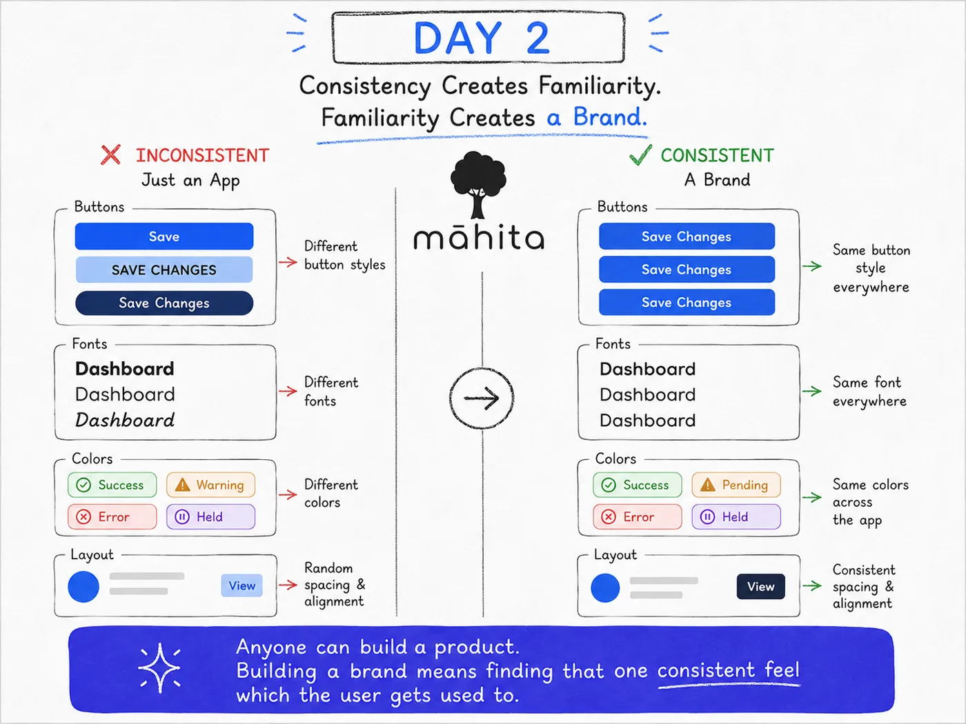
day 2 — inconsistent app vs consistent brand
#SoftwareEngineering #ProductDesign #StartupJourney #BuildInPublic #UIUX #Branding #LearningInPublic